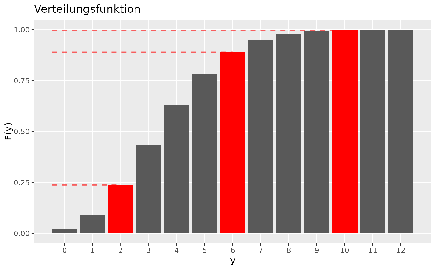
Create plots of the density and distribution functions of a probability distribution. It is possible to mark points and shade the area under the curve.
Usage
distribution_plot(
  fun,
  range,
  ...,
  points = NULL,
  var = "x",
  title = "Verteilungsfunktion",
  is_discrete = NULL
)

density_plot(
  fun,
  range,
  ...,
  from = NULL,
  to = NULL,
  points = NULL,
  var = "x",
  title = "Dichte",
  is_discrete = NULL
)
Arguments
- fun
a density or distribution function that takes quantiles as its first argument.
- range
numeric vector of length two giving the range of quantiles to be plotted.
- ...
further arguments that are passed to
fun().- points
numeric vector giving quantiles where the function should be marked with a red dot (continuous) or a red bar (discrete).
- var
character giving the name of the quantile variable. This is only used to label the axes.
- title
character giving the title of the plot
- is_discrete
logical indicating whether this is a discrete distribution. For discrete distributions, a bar plot is created. If omitted, the function tries to automatically determine, whether the distributions is discrete. In case this should fail, set this argument explicitly.
- from, to
numeric values giving start and end of a range where the area under the density will be shaded (continuous) or the bars will be drawn in red (discrete). If only one of the two values is given, the shading will start at negative infinity or go until positive infinity, respectively.

